15 Small Kitchen Color Schemes That Actually Make It Look Bigger
Alright, let’s talk kitchens, specifically those cozy little nooks that make you wonder if you can even turn around without knocking over a spice rack. If you're anything like me, you've probably stared at your pint-sized cooking space, sighing dreamily about open-concept dreams that just aren't your reality. But guess what? You don't need a demolition crew or a winning lottery ticket to make your kitchen feel expansive. Sometimes, it’s all about a little color magic. Seriously, the right palette can trick your eyes into believing there's more square footage than there actually is. So, ditch the despair, because I’m about to spill the beans on 15 small kitchen color schemes that will make your compact culinary kingdom feel like a palace.
The Power of White: Your Go-To for an Open Feel
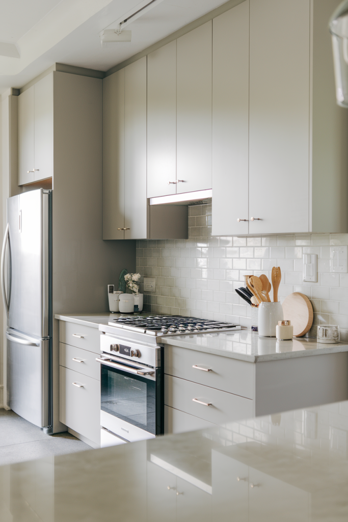
First things first, let’s get the obvious out of the way: white. I know, I know, revolutionary, right? But hear me out. White isn't just a basic choice; it's a strategic one. It reflects light like a champ, making any space feel brighter and, you guessed it, bigger. Think of it as your kitchen’s personal spotlight, illuminating every corner and pushing back the walls. But there’s a trick to it; don't just slather on any old white. We're aiming for sophistication, not hospital chic.
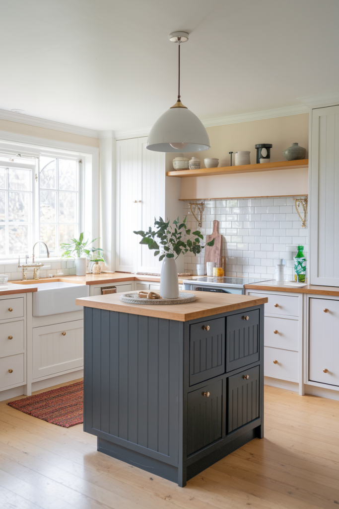
1. Crisp White with Warm Wood Accents
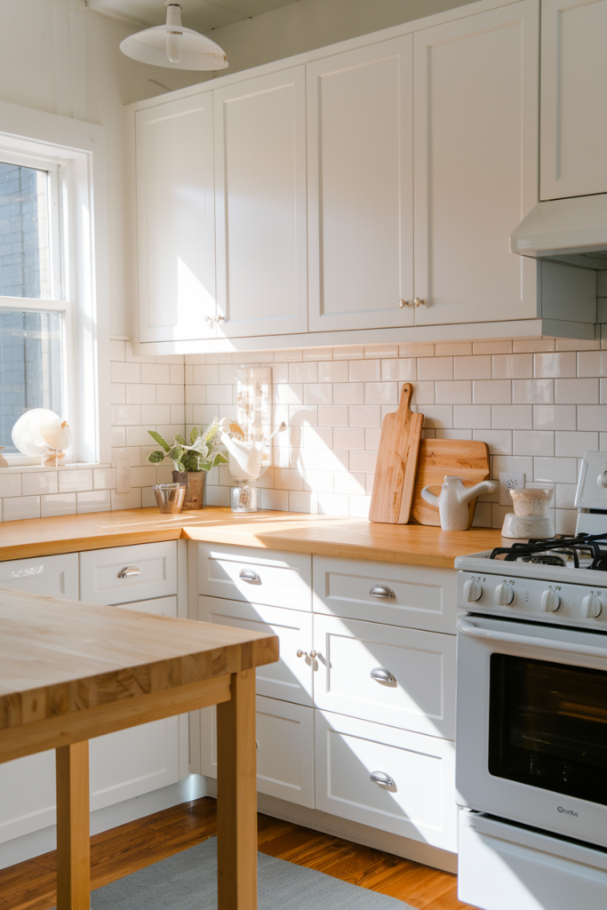
This is my absolute favorite, and for good reason. Imagine pristine white cabinets, maybe some subway tile on the backsplash, paired with natural wood countertops or a butcher block island. The warmth of the wood balances the coolness of the white, preventing it from feeling sterile. It’s like a warm hug in a bright room. Plus, the wood grain adds texture and a touch of nature, which always makes a space feel more inviting and less claustrophobic. You get the clean, airy feel of white, but with an earthy anchor that makes it feel lived-in and cozy.
2. All-White Everything (But Make It Interesting)

Okay, so you want to go full whiteout? I respect that. But to keep it from looking like a blank canvas waiting for a coffee stain, you need texture. Think white shiplap walls, white brick, or even a subtle patterned white tile. Varying textures will create visual interest without adding competing colors that might shrink the space. You can also play with different shades of white – a soft off-white on the walls, a brighter pure white on the cabinets. This creates subtle depth. Don't forget, shiny white appliances can also contribute to that reflective, spacious feel.
Light & Bright: Beyond Just White
White is amazing, but it's not the only trick up our sleeve. Light colors, in general, are your best friends in a small kitchen. They bounce light around, creating an illusion of space. Think pastels, soft grays, and even muted blues or greens. The key here is lightness.
 21 Brilliant Small Kitchen Organization Ideas You’ll Wish You Knew Sooner
3. Soft Gray and Stainless Steel
Oh, the sophistication! Soft gray, like a gentle fog, works wonders in a small kitchen. It’s not as stark as white, offering a bit more depth, but still has that fantastic light-reflecting quality. Pair it with stainless steel appliances and hardware, and you’ve got a modern, sleek look that feels surprisingly spacious. The metallic sheen of stainless steel also helps reflect light, acting as a subtle mirror. Plus, gray is super versatile and a great backdrop for pops of color if you decide to add some later with accessories.
4. Pale Blue and White
Ever wondered why the sky feels so expansive? Because it’s blue! Pale blue has a calming, airy quality that can literally make your kitchen feel like it stretches to the horizon. Combine pale blue cabinets or walls with white countertops and backsplashes, and you’ve got a serene, coastal vibe that’s incredibly inviting and open. It’s like bringing a piece of the beach right into your home, and who doesn't want that kind of breezy, relaxed atmosphere while cooking?
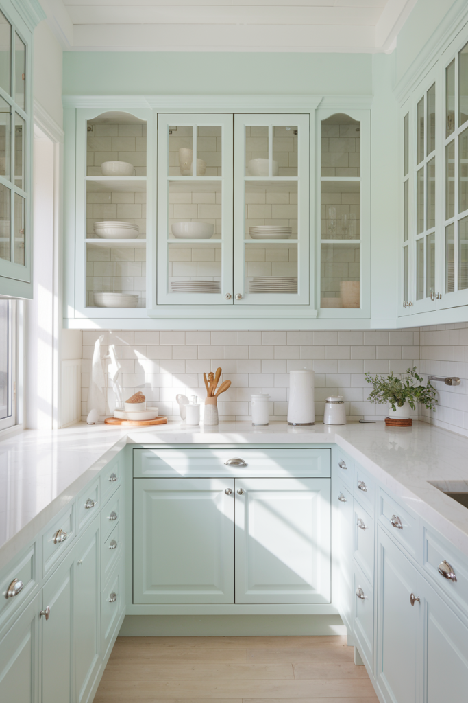
5. Mint Green and Cream
Mint green isn't just for vintage diners anymore. A soft, muted mint can bring a refreshing, almost whimsical feel to a small kitchen. It’s light enough to prevent the space from feeling enclosed, but vibrant enough to add personality. Pair it with creamy off-white or even light natural wood tones for a cheerful, yet sophisticated look. It’s unexpected but utterly charming, and it really makes a small space feel less stifling. Seriously, it's like a breath of fresh air.
The Bold Move: Strategic Dark Hues
Okay, this might sound counter-intuitive, but sometimes a well-placed dark color can actually make a small kitchen feel grander. It’s all about creating depth and drama, using the darkness to recede and make other elements pop. This isn't for the faint of heart, but when done right, it's a showstopper.
 13 Store Hacks for Small Kitchen Organization
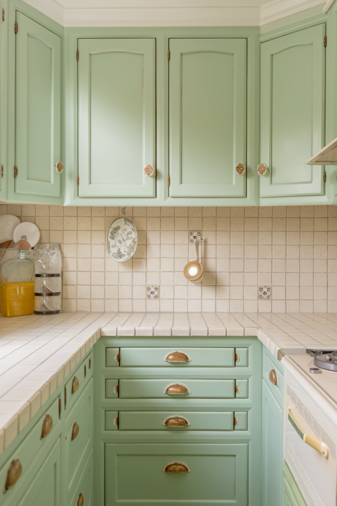
6. Dark Green with Brass Accents
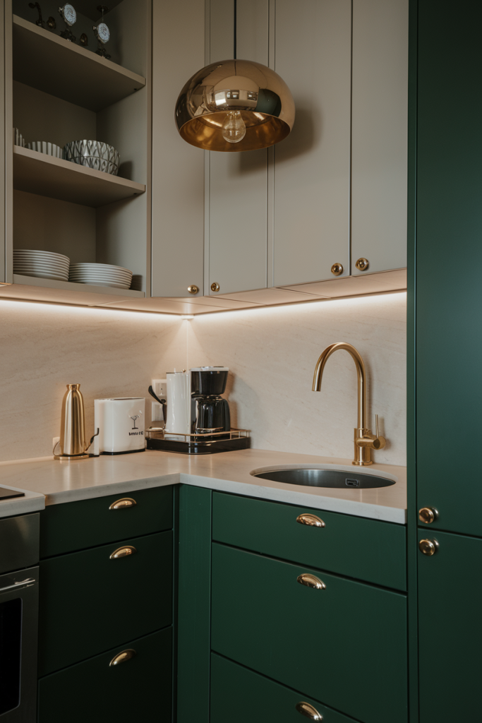
Think deep, forest green or even an emerald hue. This is a bold choice, I know, but trust me. When you use a rich dark green on lower cabinets or a single accent wall, it creates an incredibly sophisticated backdrop. Pair it with shiny brass hardware and lighting, and the contrast is stunning. The brass reflects light and adds warmth, preventing the dark green from feeling too heavy. It's a look that says, "Yes, my kitchen is small, but it's also incredibly chic."
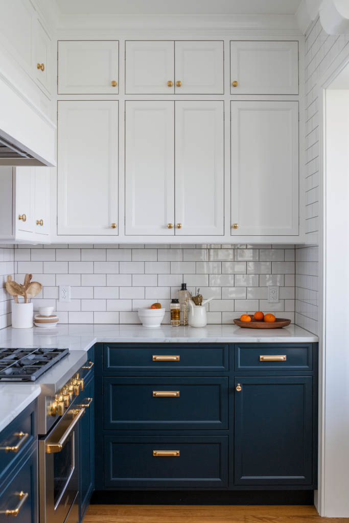
Navy blue is the new black, especially in kitchens. It’s moody, elegant, and provides a fantastic contrast. Imagine navy lower cabinets or a navy island, paired with crisp white upper cabinets and a white subway tile backsplash. The contrast between the dark and light creates visual interest and depth, making the space feel more curated. Add some glamorous gold hardware, and suddenly your small kitchen is giving off serious luxury vibes. It’s a classic combo that always delivers.
8. Charcoal Gray and Light Wood
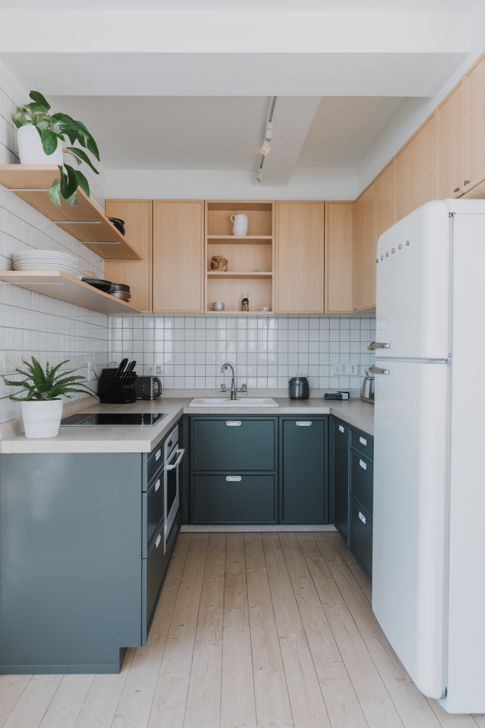
Charcoal gray offers a powerful, grounding presence. It’s not quite black, so it’s less intense, but still has that dramatic flair. Use it on your lower cabinets or a feature wall. To prevent it from sucking all the light out of the room, pair it with very light wood tones – think blonde wood flooring or light maple upper cabinets. The combination is masculine yet inviting, and the light wood keeps the space from feeling too heavy, allowing the charcoal to provide a sophisticated anchor.
Clever Combinations for Maximum Impact
Mixing and matching isn’t just for your wardrobe. Strategic color combinations can play tricks on the eye, expanding your kitchen without knocking down a single wall. This is where we get really creative with our palettes.
 10 Modern Kitchen Design Ideas to Transform Your Space
9. Two-Tone Cabinets: Light on Top, Dark on Bottom
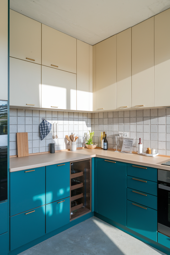
This is a classic small kitchen hack that always works. Paint your upper cabinets a light color (white, pale gray, cream) and your lower cabinets a darker, contrasting shade (navy, charcoal, forest green). The light upper cabinets draw the eye upwards, making the ceiling feel higher, while the darker lower cabinets ground the space and add visual weight. It’s a dynamic duo that creates an illusion of height and depth simultaneously. Plus, it looks incredibly stylish.
10. Light Walls, Dark Island (or vice-versa)
If you have an island in your small kitchen, even a small one, it’s a perfect candidate for a contrasting color. Keep your perimeter cabinets and walls light and airy, then paint your island a bold, dark color. This creates a focal point and adds a layer of depth, making the overall space feel more interesting and less one-note. Conversely, if your island is light, consider a darker hue for a feature wall behind it to make the island pop.
11. Monochromatic with Varying Shades
Who says monochrome is boring? Not me! Pick one color, say a soft sage green, and use varying shades of it throughout your kitchen. Lighter shades on the walls, a slightly darker shade on the cabinets, and perhaps an even darker tone for accessories or a small accent. This creates a cohesive, sophisticated look that adds depth and dimension without introducing jarring contrasts that could chop up the space. It’s subtle, elegant, and incredibly effective.
Adding Pops and Patterns: Don't Be Afraid of Personality!
Just because your kitchen is small doesn't mean it has to be bland. Strategic pops of color and subtle patterns can add personality and make the space feel intentionally designed, rather than just cramped. The key is moderation, my friend.
 25 Small Kitchen Ideas That Maximize Space Without Compromising Style
12. White with Bright Yellow or Orange Accents
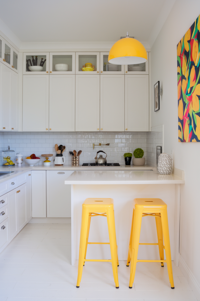
This scheme is pure sunshine! Keep your main kitchen elements – cabinets, countertops, walls – predominantly white or a very pale neutral. Then, inject life with vibrant yellow or orange accessories: a set of bar stools, a kettle, dishtowels, or a bold piece of art. These bright pops don't overwhelm the space; instead, they add energy and a cheerful focal point, preventing the white from feeling too stark. It’s like adding a zest to your kitchen!
13. Gray with Emerald Green or Sapphire Blue Tile
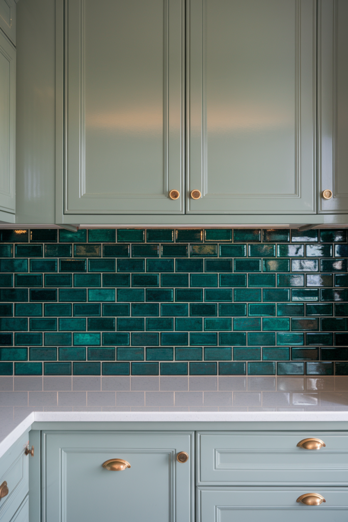
If you're going for a sophisticated gray base, consider adding a punch of jewel-toned color with your backsplash tile. A subway tile in a deep emerald green or a rich sapphire blue can be absolutely stunning. Since the backsplash is a vertical element, it draws the eye up, adding height. The rich color provides a luxurious contrast without dominating the entire space. It’s a small detail that makes a huge impact.
14. Neutral Base with Patterned Floor Tile
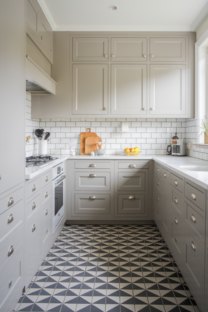
This is where you can really have some fun. Keep your walls and cabinets neutral – white, cream, light gray. Then, install a bold, patterned floor tile. Whether it's a geometric pattern, a classic checkerboard, or a playful mosaic, a patterned floor adds incredible character and draws the eye down, creating a sense of a larger footprint. Just make sure the pattern isn't too busy or overwhelming; a larger pattern on smaller tiles can sometimes work better than a small, intricate pattern.
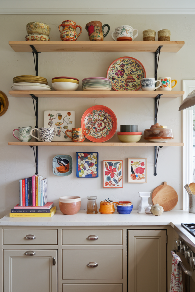
15. Open Shelving with Colorful Ceramics
 23 Gray Living Room Ideas with Curtains
Finally, let's talk about utilizing open shelving. If you have some, paint the wall behind the shelves a vibrant or contrasting color. Then, display a curated collection of colorful ceramics, glassware, or cookbooks. This creates a beautiful, personalized display that adds a pop of color and interest without taking up precious counter or cabinet space. It’s a way to infuse personality and create a dynamic visual element that draws the eye, making the space feel more expansive and thoughtfully designed.
Comparison Table: Scheme Quick Look
| Scheme Name | Dominant Colors | Feeling/Vibe | Best Feature for Small Kitchens | My Personal Take 🙂 |
|---|---|---|---|---|
| Crisp White with Warm Wood | White, Natural Wood | Airy, Warm, Modern Farmhouse | High Light Reflection, Natural Texture | My go-to for foolproof spaciousness. |
| All-White Everything (Textured) | White | Clean, Minimalist, Sophisticated | Maximizes Light, Adds Depth via Texture | Great if you're a neat freak! |
| Soft Gray and Stainless Steel | Soft Gray, Silver | Modern, Sleek, Urban | Neutral Backdrop, Reflective Metals | So chic, I could cry. |
| Pale Blue and White | Pale Blue, White | Calming, Coastal, Airy | Expansive Sky Effect, Serene | Makes me feel like I'm on vacation. |
| Mint Green and Cream | Mint Green, Cream/Off-White | Refreshing, Cheerful, Quaint | Unique Personality, Light & Bright | Surprisingly charming, a hidden gem. |
| Dark Green with Brass Accents | Dark Green, Gold/Brass | Luxurious, Dramatic, Grounded | Creates Depth, Focal Point | Bold, but boy does it pay off. |
| Navy Blue and White with Gold | Navy Blue, White, Gold | Elegant, Classic, Sophisticated | High Contrast, Visual Interest | Timeless luxury, never goes out of style. |
| Charcoal Gray and Light Wood | Charcoal Gray, Light Wood | Masculine, Modern, Grounding | Anchors Space, Balances Light | For those who like a bit of drama. |
| Two-Tone Cabinets | Light & Dark Contrast | Dynamic, Tall, Layered | Draws Eye Upwards, Adds Depth | My secret weapon for low ceilings. |
| Light Walls, Dark Island | Light, Dark Contrast | Focused, Modern, Interesting | Creates Focal Point, Visual Break | Makes your island the star! |
| Monochromatic w/ Varying Shades | Single Color (various shades) | Cohesive, Elegant, Subtle Depth | Seamless Flow, Adds Dimension | Surprisingly sophisticated! |
| White with Bright Accents | White, Yellow/Orange | Cheerful, Playful, Energetic | Pops of Color Without Overwhelm | Instantly lifts my mood. |
| Gray with Jewel-Tone Tile | Gray, Emerald/Sapphire | Elegant, Luxe, Vibrant | Adds Punch, Draws Eye Up | That little sparkle your kitchen needs. |
| Neutral Base w/ Patterned Floor | Neutral, Patterned | Characterful, Grounded, Bold | Adds Interest, Visual Footprint | A brave choice, but oh-so rewarding. |
| Open Shelving w/ Colorful Ceramics | Neutral, Various Colors | Personal, Artistic, Curated | Personalizes, Adds Visual Interest | My excuse to buy more pretty dishes. |
Final Checklist Before You Dive In:
- Natural Light Check: How much natural light does your kitchen get? If it’s practically a cave, lean heavily into the lighter color schemes. If you’re blessed with abundant sunshine, you can experiment more with strategic darker hues.
- Existing Elements: What can’t you change? Your flooring? A large appliance? Work with these elements, not against them. Pick colors that complement what’s staying.
- Your Personal Style: At the end of the day, this is your kitchen. Choose colors that make you happy. Don't pick something just because it's trendy if it doesn't resonate with your soul.
- Test, Test, Test: Don't just pick a color from a chip. Buy sample pots and paint swatches on your walls. Look at them in different lights throughout the day. What looks great in the store might look totally different in your kitchen. Trust me on this one; I’ve learned the hard way.
- Consider Reflective Surfaces: Think about how light bounces around. Shiny finishes (like high-gloss paint, polished chrome, or glass) will amplify the feeling of space. Matte finishes absorb light, so use them strategically if you want a more cozy, less expansive feel.
So, there you have it, my friend. Fifteen ways to trick your brain (and your guests) into thinking your kitchen is far more spacious than its actual square footage suggests. It's not about magic, it's about smart design and the incredible power of color. You don’t need a massive renovation budget to create a kitchen that feels open, airy, and utterly fabulous. Just a little paint, some thoughtful choices, and maybe a dash of that clever strategic thinking. Now go forth and conquer that small kitchen; it’s practically begging for a glow-up! Happy painting!
You may be interested in: